 by
by 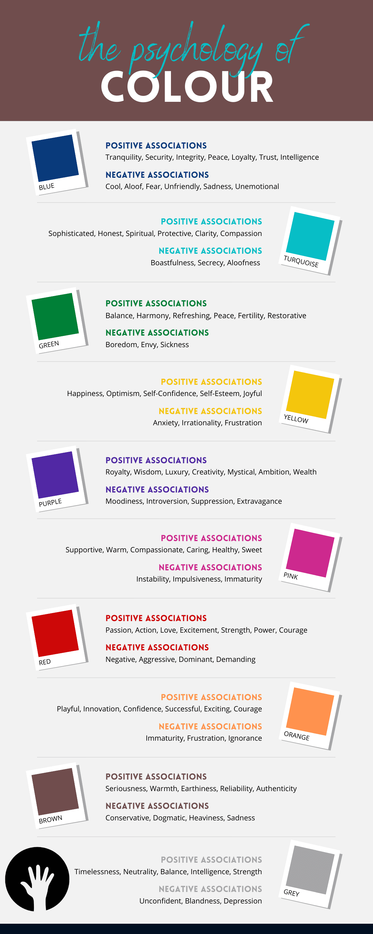
Color psychology is the study of how colors can affect human behavior, emotions, and attitudes. It is a fascinating topic that has been studied by researchers and utilized by marketers and designers to influence consumer behavior. Here, we will explore the basics of color psychology, the meanings behind different colors, and how they can be used in marketing and design.
The Basics of Color Psychology
Color psychology is based on the premise that colors can elicit emotional responses in humans. Different colors can evoke different emotions, which can influence our behavior, mood, and decision-making. For instance, the color red is often associated with excitement and passion, while blue is associated with calmness and stability.
The meanings behind different colors are not fixed and can vary based on culture, personal experience, and context. However, there are some common associations that are widely accepted across different cultures and contexts.
Meanings Behind Different Colors
Red: Red is often associated with passion, excitement, and energy. It is also associated with danger, warning signs, and caution. In marketing and design, red is often used to create a sense of urgency or to draw attention to a product or brand.
Orange: Orange is associated with enthusiasm, creativity, and excitement. It is often used in advertising to create a sense of fun and excitement.
Yellow: Yellow is associated with happiness, optimism, and warmth. It is often used in marketing and design to create a sense of joy and friendliness.
Green: Green is associated with growth, health, and nature. It is often used in marketing and design to promote environmentally friendly products or to create a sense of calmness and relaxation.
Blue: Blue is associated with calmness, stability, and trustworthiness. It is often used in marketing and design to create a sense of reliability and professionalism.
Purple: Purple is associated with luxury, creativity, and sophistication. It is often used in marketing and design to create a sense of exclusivity and high-end products.
Pink: Pink is associated with femininity, romance, and sweetness. It is often used in marketing and design to target female consumers or to create a sense of romance and intimacy.
Black: Black is associated with power, elegance, and sophistication. It is often used in marketing and design to create a sense of luxury and exclusivity.
White: White is associated with purity, simplicity, and clarity. It is often used in marketing and design to create a sense of cleanliness and simplicity.
How Colors Can Be Used in Marketing and Design
Understanding color psychology can be useful in marketing and design as it can influence consumer behavior and attitudes toward a product or brand. By using the right colors, businesses can create an emotional connection with their audience and influence their decision-making.
For instance, a company that sells environmentally friendly products might use the color green to promote its brand and create a sense of environmental responsibility. A luxury brand might use the color purple to create a sense of exclusivity and high-end products.
Colors can also be used in website design to create a sense of user experience. For instance, a website that sells products to calm anxiety might use blue to create a sense of calmness and relaxation.
In conclusion, color psychology is an essential tool for marketers and designers as it can influence consumer behavior and emotions. By understanding the meanings behind different colors and how they can be used in marketing and design, businesses can create effective advertising campaigns and build a strong brand identity.